A known brand in the German language market, Wettfreunde is the go to place for in-depth match analysis, data based sports betting tips and outrights odds comparison.
In March, the team launched an extensive redesign of the Wettfreunde website, including a new logo and a reworked structure of the website to improve the user experience.
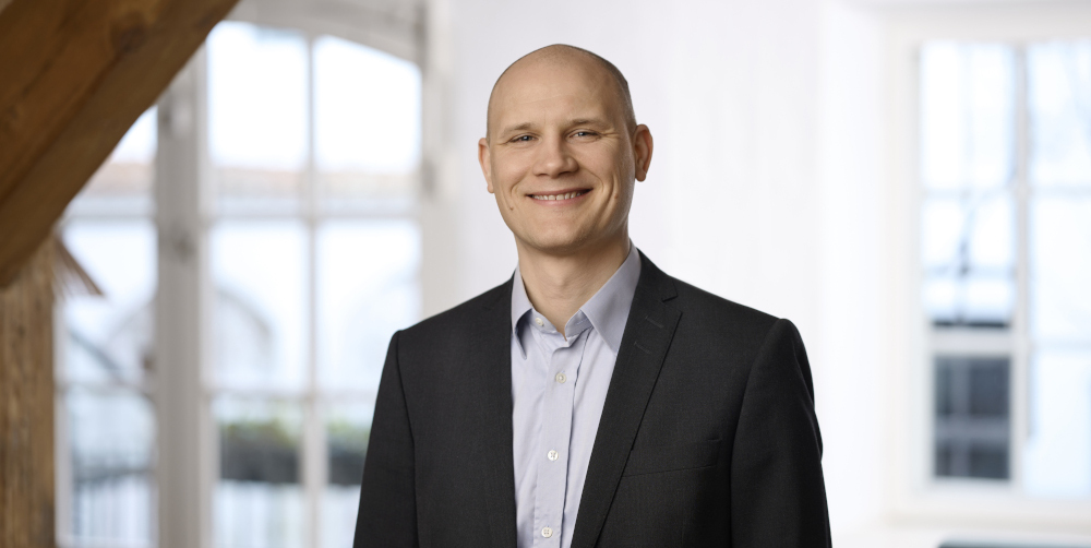
We caught up with Sebastian Faurholdt (pictured), a web designer at Better Collective and head of this project, to find out more.
SBC: Why did you decide to have Wettfreunde redesigned? And what were you aiming for from a UX perspective?
SF: Wettfreunde was getting a large amount of traffic, but of those very little CTP and CVR. The bounce rate was pretty high as well, compared to the users visiting.
Therefore, it was our main goal to optimise the CTA elements and to build more trust around the brand. For that, we designed a better navigation without changing the content – since this could have affected the SEO value of the page.
SBC: We talked before about an “exhaustive educational section” to help users on the way to sports betting success; has this been impacted by the redesign?
SF: Yes, this time, the primary focus was on the heart of the Wettfreunde website – the tips and odds section. That is the reason why the exhaustive educational section, such as Sports Betting Tools, News and Bookmaker Tests are now at the footer of the page, and no longer a part of the main navigation.
Sportwettentest, a similar product, will be created in the opposite approach. There will be a more in-depth academy section with emphasis on the educational value behind it.
SBC: What did you have to do to ensure that the site’s personal (‘from betting friends, for betting friends’) feel was not lost?
SF: In order to do that, we tried to create a Wettfreunde persona, which resulted in being “a friendly neighbourhood betting expert”. From then on, it was clear that we needed to make the style and appearance of the page friendly, transparent and helpful. At the same time we needed to keep the trustworthiness that is achieved by the journalists’ professionalism.
We did that by highlighting the journalists for every piece that they wrote, and by giving the content managers the opportunity to add a quote next to their profile avatar, for example “This is my favourite tip”, or something that is more personal to them, such as “Go Bayern München”. The new colour scheme, pattern and strict style of design was made to made Wettfreunde even more recognisable as its own independent product.
SBC: How do you measure the success of this redesign? Can you already see improved results from the traffic data on the page?
SF: Since the page was only relaunched beginning of last month, we don’t have very detailed data yet. But by comparing the depositors per session rate before and after the changes, we are seeing an increase of 34%. But these are just the first findings.